Wednesday, October 27, 2010

Quick & Easy: Fall Card Sets

One of the the things I really love about Season of Thanks is that in addition to all of the wonderful images included to create custom projects, there are also three fantastic "pre-fab" images included as well. I like to think of them as design shortcuts. A little cardstock and ink is all you need to whip together a fantastic set of cards.

This project is quick, inexpensive, and chic. What more can you say? I whipped together a fun 6 card set with matching envelopes at a whopping cost of $1.35 in materials. The final cost will vary depending on the cost of your envelopes and number of cards in your set, but the cards average $.06 each in consumables! And...the whole set can be created from start to clean-up in about 20 minutes.

For a six card set, you will need:

  • 4 pieces of cardstock (3 for the card bases and 1 for your focal images)
  • 6 envelopes
  • Season of Thanks and ink

Start by stamping 1 row of each image design onto cardstock. I used Chocolate Chip cardstock (Stampin' Up!) with Vintage Cream ink (Papertrey Ink). Trim each out leaving about a 1/4" border around all. Since these are all straight cuts you can use your paper trimmer...super quick! Click on the image below to see a larger view.

Cut each of the remaining three pieces of Kraft cardstock (Papertrey Ink) in half longways (portrait style) to create 6 portrait 4.25" x 5.5" card bases. Score at 5.5" and fold. Now just adhere your focal image to the front of each card base. I popped the top card up on dimensionals, but left the rest flat. I like to make sure postage will be inexpensive and the cards will remain intact through the postal service for the recipients of my gift sets.


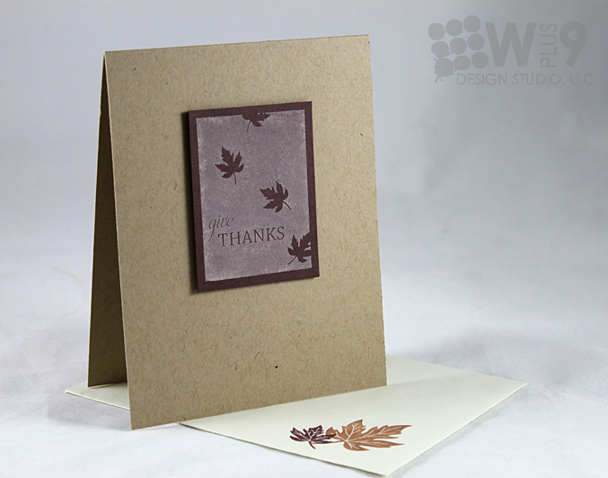
As a final touch, you can coordinate your envelopes. There are many ways to do this, but for mine, I used some complimentary images from the same set and embellished the lower corners of the envelope fronts.

Now I just couldn't stop there, I mean, that only took 20 minutes! So, while I had the same set out I decided to use the image from the first set as my guide to create another even more cost effective set. Just $.05 per card in consumables!

Using the separate images also included in Season of Thanks I recreated the "falling" images and sentiments across my card fronts. A little inking around the edges for interest and a rustic feel...and done. 10-15 minutes flat for a whole set, and it looks like I surely spent forever on it. ;o)

Thanks for stopping by today. We have a fantastic release this month. Big. Huge. So big in fact, we are delaying it a bit. We will be releasing 4 new stamp sets, 1 new digi-stamp set, and one of our Design Team will be making her debut as a Stamp Designer with not 1, but 2 sets! Talk about exciting. I will be keeping you posted both here on the blog and on theWplus9 Facebook page as it approaches. You will not want to miss all of the festive fun!

Tuesday, October 26, 2010

On Cue With Color {8}

Emily Leiphart
Oh Emily, Emily, Emily...you stole my heart with this one.

Congrats to all of the fave picks, and thanks so much to all of you who participate in the challenge again and again. Talk about a hard choice! There were so many FANtastic entries! I enjoyed seeing what ya'll came up with for this color combo. ;o)

Be sure to check out all of the entries if you haven't already. The Color Cue is always packed with tons of talent and inspiration!

Congratulations Emily, you and your card will be featured on the homepage at the Studio, www.wplus9.com!

Thanks again to everyone who played along. If you are itching for a new combo, why not try out the current Color Cue? You have until November 7th to play along!

Saturday, October 23, 2010

Caring Hearts Blog Hop

Welcome to the Caring Hearts Card Drive Blog Hop! Vera has invited us to share a holiday card today to help promote the card drive. I chose to create a simple Thanksgiving card.

If you came from Donna Mikasa's blog you are on the right track. If not, be sure to start at the beginning from Vera's blog, the organizer of this fantastic effort.

What is the Caring Hearts Card Drive? Vera Ling has put together a card drive to collect holiday cards for the elderly that live in nursing homes, care centers and places of assisted living. With a host of sponsors including Wplus9 Design Studio, Lawn Fawn, Hero Arts, andSimon Says Stamp just to name a few, there are ton's of prizes to be won. And all you have to do is create a holiday card and send it to Vera. Be sure to visit her blog to get all of the details.

Now, off to Deirdre Hogan to continue the hop!

Project Supplies

Stamps: Season of Thanks (Wplus9)
Paper: Rustic Cream (Papertrey Ink)
Ink: Summer Sun, More Mustard, Close to Cocoa, Really Rust (Stampin' Up!); Dark Brown chalk ink (Colorbox)
Other: Button (Papertrey Ink); Baker's twine (Martha Stewart Crafts)

Wednesday, October 20, 2010

All Eyes On...Ever After

Welcome to All Eyes On!

This month I asked the ladies to share with us a creation using either their favorite Wplus9 stamp set, or the one they just can't get enough of at the moment.

For me, it was a toss up between Kisses & Cuddles and Ever After. I love, love, love both of these sets. But I had a layout in mind, and Ever After fit the bill. Maybe it's because I get to practice with my Copic coloring or maybe it's the gorgeous font used for the sentiments, but something about this set makes me reach for it again and again.

I started by stamping the stemmed flower image on white and coloring the Gardenias a fun and vibrant mix of corals, yellows, and peaches. I cut the bottom square and trimmed around the edges of the image. I attached this to a white panel by using tape adhesive at the bottom, and dimensionals at the top. This makes the flower really "pop" off of the page.

I stamped a second image, colored and trimmed out just the center of the large flower and popped it with dimensionals over the bud on the left side. I just wanted a little half bloom. To finish this simple card, I stamped my sentiment, attached a coral border punched strip to the left edge and adhered the whole panel with dimensionals to my card front.

I love the visual line that is created from top left to bottom right, and how all of the white space helps make the flowers seem even more vibrant and crisp in spite of the rather soft tones of the petals.

Wanna see what the Design Team has been up to?

Friday, October 15, 2010

2Sketches4You #63

I'm back with the details and supplies for the card I created for the current Color Cue and the sketch from 2Sketches4You that inspired it.

Don't you just love that pattern? I created it using 3 of the images from our newest release, Poinsettia Patterns. When I say the possibilities are limitless...I'm not exaggerating. Below is a pictorial of the steps I used to create this pattern.

I stamped the first two images to get my pattern started. Once I had my spacing correct, I stamped a row of each image, alternating between the two. To finish, I came back with the smallest image in the set and stamped into the space created where the other two images met.

The focal point of this card is just a collage of elements. I created the circle (or half circle)from the sketch by using half of a doily, I have a ton of these left over and this color palette just screamed "use a doily!" to me. ;o) I created one of those "poofy" flowers, just because it had been a while. The only difference is I spritzed each scallop punched piece (5 in all) with a bit of water before scrunching them up. This allows them to get super wrinkly, giving the appearance of a carnation...or a peony possibly. I added a little tag stamped with a sentiment, also from Poinsettia Patterns, and added a butterfly to the bow.

I matted it all on black and then adhered that with dimensionals to a black card base. Now, if I wasn't too lazy to pull out a sewing machine...some stitching would have taken this over the top...but I'll leave the sewing to the resident pros. ;o)

So, all in all, I strayed from the sketch just a bit. But hey, that's what a sketch is for, right? It's a wireframe for a design. A starting point. Something to get the wheels-a-turning and the creative juices flowing. And I love what this sketch helped me to accomplish. So THANKS! Kazan and Laura for the inspiration!

Supplies:

Stamps: Poinsettia Patterns (Wplus9)
Ink: Pretty in Pink craft ink (Stampin' Up!); Midnight Black (VersaMagic); Tattered Rose Distress Ink (Tim Holtz Ranger); Fresh Snow (PTI)
Cardstock: True Black, Sweet Blush, White (PTI); Pretty in Pink (Stampin' Up!); Doilies (Wilton)
Other: Scallop Punch, Corner Rounder (Stampin' Up!); White Satin Ribbon (Offray); Black pearls (Kaiser)

Color Cue {9} Challenge

Details

October is Breast Cancer Awareness month. This month's Color Cue Challenge is our little reminder. Create a card, scrapbook page, digital layout, tag, whatever...just make sure to use the above colors, light pink, white, and gray or black.

Create your project and post it to your blog or online photo gallery such as Flickr or SCS. Add a direct link to your project (not your homepage please) by clicking the "add your link" button below.

Deadline

You have until November 7th at 10:59 pm EST to play along. You will know the deadline has passed when the link to add your project is no longer available.

Bonus

If you have Wplus9 stamps in your stash, now would be the time to bust them out. I will be collecting lucky participants to feature as "On Cue with Color" here on the blog and at The Studio. If you don't have any yet...don't worry I still want to be inspired by you and you will still be featured here on the blog!

Here's some inspiration from the Wplus9 Design Team to get you started. Just click on each name to visit their blog and get the details on their projects.

I know, I know, I do not know actually. I do not know what has gotten into me. With these frills and layers and doilies?! I decided to pair our new release Poinsettia Patterns with the latest sketch over at 2Sketches4You, and this is what happened. LOL


Elise Durenberger


Jinny Newlin


Kerrianne Gwin


Maile Belles


Savitri Wilder

Now it's your turn! Add your link below.


Friday, October 8, 2010

October 2010 Release Group Post

What a fantastic release! In case you haven't heard, the entire October release is now available at the studio, www.wplus9.com. The Design Team really came through with some gorgeous creations this month...as they always do. I wanted to share just a couple more with you all.

Elise Durenberger never fails to impress me with the extremes that she goes to in her paper crafting. This girl has skills! I love the way she turned the Damask image from Damask Frames into a spider and hung him over that incredible background.

Hannah Craner always has the cleanest designs with the boldest colors. Her use of Poinsettia Patterns for this tag is so simple on design but loaded with style. I love the polka dot ribbon and the way her rhinestones incorporate the polka dots onto the tag.

Jinny Newlin's use of Season of Thanks with this unconventional fall color palette is just stunning. I especially like the way she used the ribbon's color on the leaves and placed them behind the bow. They almost seem like an extension of the bow itself.

Kerrianne Gwin pulls out yet another beautiful pattern with Poinsettia Patterns. Raspberry, glitter, peace & joy, Oh my! What's not to love?

Maile Belles joins in with another hit this month. Pairing up Damask Frames and Season of Thanks with a gorgeous and rich color combo. I love how the leaves are just kissing the edge of the card and are balanced my the pumpkins just slightly hanging of the other edge.

Savitri Wilder leaves me wishing her stamps had arrived on time as I want to see MORE! I think the thing that stands out the most to me is how natural she has made the color combo look. Orange, blue, pink, and brown?! Seriously delicious in a way only Savitri can pull off.

Please be sure to visit each of these talented ladies and leave them some encouragement. They love to read your comments! And as always, I want to thank you all for leaving me comments and joining me every month. You guys provide me so much inspiration through reading your comments and visiting your blogs. Thanks!

Thursday, October 7, 2010

October 2010 Release Now Available!

The wait is over! The Wplus9 October Release is now available at the studio, www.wplus9.com. Thanks for joining us! I will be back a little later with with my favorite post, the Wplus9 Design Team Group Post.

Wednesday, October 6, 2010

October 2010 Release: Full Reveal

Tonight is the night! I am so thrilled with all of the excitement surrounding this release. The design team has done an amazing job showcasing these sets and I am so grateful to have such talented ladies on the team. Hopefully we've gotten you pumped up and ready for the full reveal.

Introducing the newest additions to the Wplus9 Design Studio. All sets will be available for purchase on Thursday, October 7th at www.wplus9.com.

Damask Frames

Details

Set of 13 high-quality photopolymer stamps;
3 sentiments, 4 frames, 2 journaling lines, and 4 accent images
Full Set Dimensions: 6x8
Price: $19

Season of Thanks

Details

Set of 18 high-quality photopolymer stamps;
12 images and 6 sentiments
Full Set Dimensions: 6x8
Price: $19

Poinsettia Patterns

Details

Set of 18 high-quality photopolymer stamps;
12 background building images and 5 sentiments, and 1 frame
Full Set Dimensions: 6x8
Price: $19

Thanks so much for joining us for another release, we will be back tomorrow for Group Post Day. And don't forget, there's still 1 more day to play along in the current Color Cue Challenge!

October 2010 Release Sneak Peeks Day 3: Poinsettia Patterns

We are back, with day 3 of the Wplus9 Design Studio October Release! Thanks to all of you who are joining in again, and welcome to those of you that are new.

Today, we are introducing our first Holiday stamp set this season. When I started to design this set, I knew I wanted a holiday set that I could truly use year round. Something with a holiday vibe, but not all cutesy and slap you in the face with Christmas. So I started brainstorming and looking at all of the different Christmas elements. I finally settled on the Poinsettia. But again, I didn't just want an obvious poinsettia. So I started to illustrate my graphic interpretation of a poinsettia and then illustrated a ton of background building pieces that all pulled from that original image. I am glad to say "mission accomplished"! I just love this set, wait until you see it in action!

Poinsettia Patterns

  • is a 6x8 clear photopolymer stamp set
  • contains 18 stamps; 12 background building images and 5 sentiments, and 1 frame
  • will be available for purchase October 7th for just $19

This is the image that started it all folks.

Is that not gorgeous?! Side note: It still feels weird to refer to any of my own artwork in such a vain way. I started by stamping the poinsettia repeatedly in Real Red ink (SU!) onto White cardstock (PTI). I then came back and stamped the smaller accent image in between each one. I continued about 2/3 the way up the panel, and then added a small strip along the very top edge.

I stamped the Peace & Joy sentiment from this set in Midnight Black (Versamagic) inside of a frame from this month's "Damask Frames". You'll noticed that most of the sentiments in this set also fit inside the frames from "Damask Frames". Love it. I added a big red satin bow and adhered the panel to my card base in Pure Poppy (PTI).

I added some black pearls (Kaiser) for a little extra elegance. I just love how bold and rich this one is.

Next up is another elegant stunner. And this photo just doesn't do this justice. If you haven't messed with metallic embossing powders yet, this is the set to experiment with.

I stamped another of the images in Versamark onto some Vellum (PTI) and heat embossed it using silver embossing powder (Stampendous) and layered it over Basic Black (PTI) cardstock. In person, this is simply stunning. So much so, that I did it again in gold. I must try this on those clear glass ornaments. If I don't break them...I bet it will be gorgeous. LOL I added the sentiment by embossing it in black on vellum as well. To add the bow, I used my Crop-a-dile to punch a hole in either side and then thread it through. Matted the panel on simple white cardstock and adhered it to a Scarlet Jewel (PTI) card base. Such a regal color combo.

My final sample for the night uses a Victorian Holiday color combo. I was still on a tag kick, so I created simple one that is perfect for mass production.

Isn't that background pattern to die for? I looks so intricate and complicated, but it is so easy to create. I simply used another of the images included in the set and stamped it repeatedly in straight lines onto Berry Sorbet (PTI) cardstock in Vintage Cream (PTI) ink. I used a Spellbinders label die to cut the base.

For the focal point, I punched a 1 3/4" circle (SU!) and stamped another of the images from this set slightly hanging off the edge and added my sentiment right over top in Dark Brown chalk ink (Colorbox). I added a pearl, inked the edges, and matted it on a scallop circle (Spellbinders) before adhering it with some dimensionals to the center of the base. Easy! Here is a close up so you can see the details of that pattern.


That's it from me today, but don't forget to check out what some of the other Design Team members have for you:

Want to win Poinsettia Patterns? Leave me a comment by 11:59 pm EST October 6th and I will pick 1 random winner from the comments to win "Poinsettia Patterns". All winners will be posted here, so be sure to check to see if you've won. I'll be back later this evening to post the full reveal before the sets go on sale at midnight!

Monday, October 4, 2010

October 2010 Release Sneak Peeks Day 2: Season of Thanks

Welcome to Day 2 of the Wplus9 Design Studio October Release! I am so thrilled to bring you our second set for this month, Season of Thanks. With Fall being the season of Thanksgiving, how appropriate to bring you a set centered around giving thanks.

Season of Thanks

  • is a 6x8 clear photopolymer stamp set
  • contains 18 stamps; 12 images and 6 sentiments
  • will be available for purchase October 7th for just $19

For my first card, I started by stamping 2 of the leaf images included in the set in Close to Cocoa and Dusty Durango ink (both Stampin' Up!) onto white cardstock (PTI).

Next I used one of the 3 bold graphic images to create my focal point. I inked it up using a brayer to apply Dark Brown chalk ink (Colorbox) to get an uneven rustic feel. I added another trimmed leaf and a button to the corner and added a lot of distress ink all around.

I really loved the simplicity of this card, but just for a little added interest I rounded the two bottom corners.

I also wanted to show you that you can get a nice clean impression with this image as well.

Sometimes large solid stamps can be tricky. The image on the left is stamped using Stampin' Up! dye ink, and the one on the right uses Martha Stewart pigment ink. For large stamps, it's all about ink coverage. To get a crisp clean impression, I found pigment inks work best. Make sure you have nice even ink coverage on the entire surface of the stamp and be sure to press evenly over the entire image when stamping.

This next card is probably my favorite. I used the 2 pumpkin images and a little masking to create a trio of pumpkins and stamped my sentiment directly over the pumpkins.

That image just makes me long for cooler weather! Here's a tip: Since both of the colors I used for my image and sentiment were deep, I needed to add some separation between the two. So I first stamped my sentiment in white, and then stamped it again in brown offset just a bit. I absolutely love how this turned out.

For the background, I stamped a couple of panels using the small leaf in Fresh Snow ink (PTI) on Dusty Durango, Kraft (SU!) and Chartreuse (PTI) cardstock and layered them behind the die cut focal image. Another thing I am digging at the moment is layering my distress inks. For this card, I inked the edges first in white and then in Walnut Stain (Ranger). LOVE it!

And finally, a card that can be easily mass produced in several colors and used for anything by swapping sentiments. I started this one by stamping an acorn sprig and the small leaves in Versamark onto Lemon Tart cardstock (PTI). I added this set's namesake sentiment to the bottom in Dark Brown.

The focal point is actually an image from tomorrow's set. So you will have to wait until tomorrow to learn more about that. ;o) I stamped it in So Saffron ink (SU!), matted it with Harvest Gold (PTI), added a button (PTI), some baker's twine (Martha Stewart) and adhered the whole thing to a white card base with dimensionals.

I really like the white on white addition of scallops in the background. I think the subtle placement behind the sentiment adds a great balance.

That's all I have for today, I hope you are enjoying the countdown so far. Want to see more "Season of Thanks"? Stop by to see what some of the Design Team is up to:

Want to win Season of Thanks? Leave me a comment by 11:59 pm EST October 5th and I will pick 1 random winner from the comments to win "Season of Thanks". Winners will be posted here, so be sure to check to see if you've won. I'll be back tomorrow with our final set...a holiday set that can truly be used year round! And another chance to win!

Connect with us:

Follow Us on Pinterest